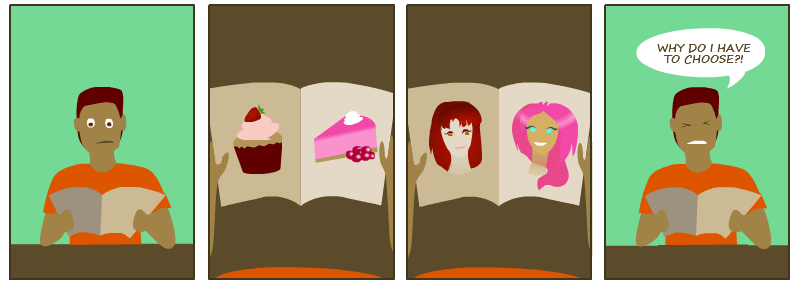
I’ve submitted a guest comic to Candi. I think I might be too late, but fingers crossed, Starline might like it and put it on the site, or into the forums.
Illustrations, CSS experiments, bits and pieces

I’ve submitted a guest comic to Candi. I think I might be too late, but fingers crossed, Starline might like it and put it on the site, or into the forums.
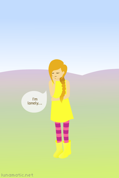
Page one finally goes up! Gah, why didn’t anyone warn me it would be so much effort to make a webcomic! Really, it’s been through three different style changes, and four website redesigns at this point. Maybe I should stop being so fussy about every little detail, and just try to actually produce something.
So, the story begins with a little girl called Emma sulking away and feeling lonely. She really should be careful what she wishes for though…

From the posts below, you might think that Emma’s story takes place entirely in the countryside, in the tiny little cottage, but sometimes they go to the big city. So this background image will be used for urban scenes. The cityscape is mostly based on Dublin, with old, shabby Georgian architecture in the front, and a hint of Christ Church Cathedral in the distance.

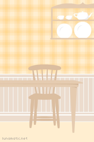
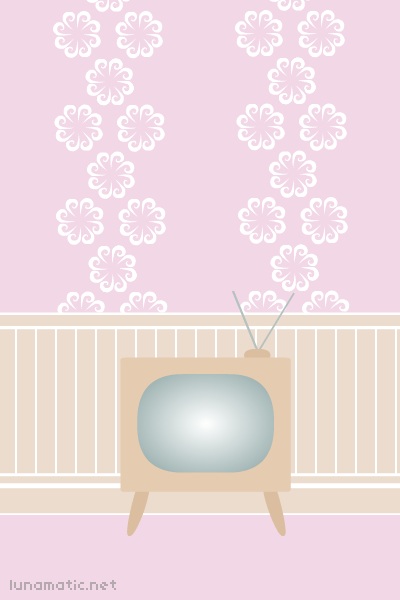
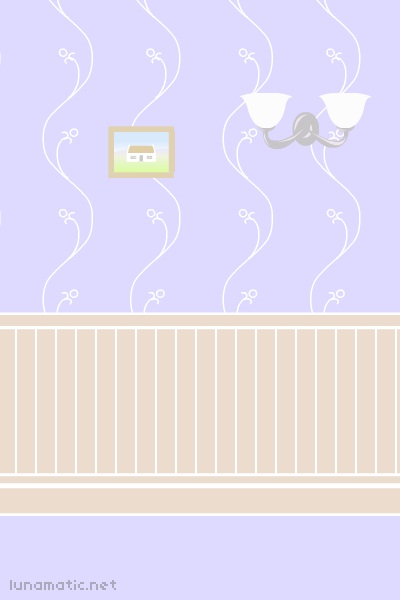
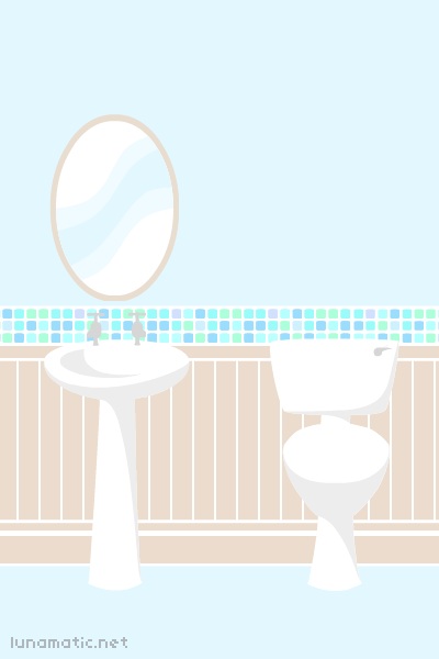
More background images for my webcomic, Emma and the Granny Fairies. A lot of the action takes place indoors, so the cottage interior decor was quite important. Each room has its own colour scheme.
The bedroom has soft yellow wallpaper. The main character, Emma, wears yellow a lot, so this room is a reflection of her. There are some toys scattered around too, a teddy bear and some building blocks. I was going to put letters on the wooden blocks, like maybe spelling out the word ‘trouble’ or ‘wisdom’, but I couldn’t think of anything perfectly appropriate, and it would have made the background too detailed and fiddly. The whole point is that they should just provide a setting and not compete with the characters for the readers attention.
The kitchen has pale orange wallpaper with a gingham pattern, and wooden furniture. Warm colours help to stimulate the appetite, so that’s why this room is so peachy. I planned to make an elaborate apricot pattern for the wallpaper, but it ended up looking too fussy, so that’s where the gingham came in. A lot of the furniture in this scene is inspired by furniture that was in my house as I was growing up.
The sitting room is powder pink. There is nothing really high tech in the house, so even the television has a vintage style to it. The atmosphere is very domestic and safe. The adventures that happen in these scenes are small adventures, the kind of moments you can look back on and smile about easily.
The hallway is forget-me-not blue, with a framed picture of the cottage on the wall, to provide a thread of continuity. It also has an upturned wall lamp to welcome the residents in out of the cold.
The bathroom is painted aqua blue, with a border of small mosaic tiles. It has a white sink, with a large oval mirror over it, and a simple toilet. Sinks and toilets are actually really nice to draw with vectors, because they are made up of such smooth crisp lines, unlike a saggy old sofa or something plush like that.
That’s quite a lot of rooms. The cottage looks so small from the outside, how do they fit everything in! It must be laid out very carefully inside!

Lately I’ve been doing a lot of prep work for my webcomic. Everything is quite well planned out now, and I’m nearly finished preparing all the background images for it. This cottage is the main setting, where the characters spend most of their time. The colours are pale so that the characters will stand out on it well.
Update: I finally caved in and gave it a red door at Barbara’s insistence. She is an expert cottage fancier.