Bananas, each in one element CSS. Assets for Forest Frenemies (still in alpha). Have a go here: https://jsbin.com/jojigur/edit?css,output
Illustrations, CSS experiments, bits and pieces

Bananas, each in one element CSS. Assets for Forest Frenemies (still in alpha). Have a go here: https://jsbin.com/jojigur/edit?css,output

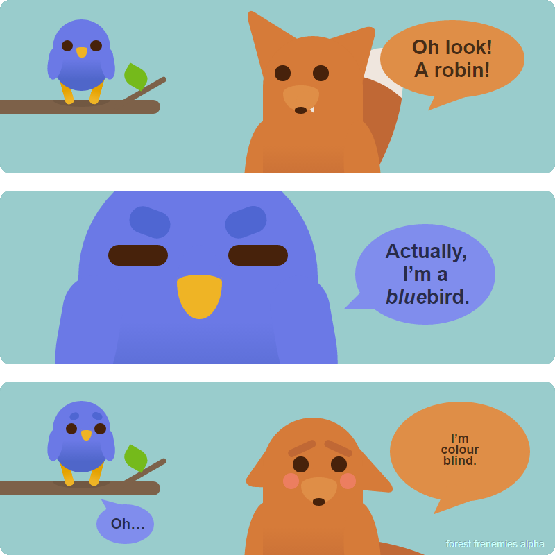
So, I’ve been chugging away with my experimental “CSS illustration as comic” project for a while now, and posting .png outputs of the results on forestfrenemies.wordpress.com. Today there is a new character, who is definitely not a robin.
At this point I have prepared about five pretty sturdy characters, (fox, rabbit, bluebird, wolf and bear), with a variety of modular facial expressions and postures. Creating a new panel without any new content only takes about half an hour or so, which is pretty handy. Scaling is lovely and clean, and every time I add a new element, it can be stashed away for reuse later, saving more time in the future.
If you’d like to play around with the CSS on this page, here it is on jsbin: https://jsbin.com/roride/42/edit?css,output. It’s pretty scruffy and not cross-browser compatible right now, so consider yourself warned.

Another creature from the woodlands. This one is an implausible pink. These little guys were originally designed to be knitted finger puppets.

Behold the magnificent derpen fox. He’s a collection of CSS shapes, for easy posing and animation. Here he is in his natural habitat.

Another CSS typography experiment! Live version here »
This one caused me a bit of trouble because of assumptions about universally available fonts. Android phones for example, don’t necessarily come with Impact as standard, which was a bit of a shock!

Just how far can we push CSS styling on text? Pretty bleedin’ far these days.
This is an experiment in CSS typography. Live version here »
The text is fully select-able, copy-paste-able, and accessible. Many of the effects are hung on spans, of which there are over a dozen, so semantically speaking, it’s a bit naughty. If the characters weren’t different shades I could have gotten away with a lot less span spam.
The letters are squeezed together with a bit of negative letter-spacing, and this has the odd effect of clipping the text-shadow in pretty much everything except Chrome. IE9 is not equipped to deal with text shadows, which lessens the impact a lot.